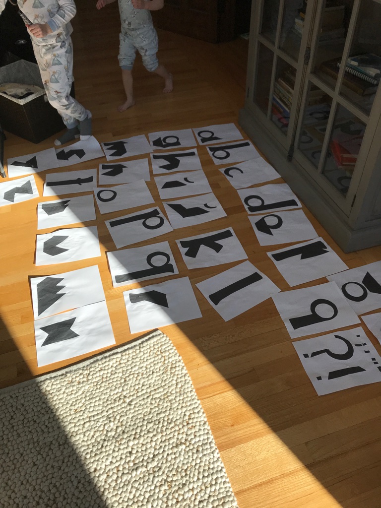
alphabet
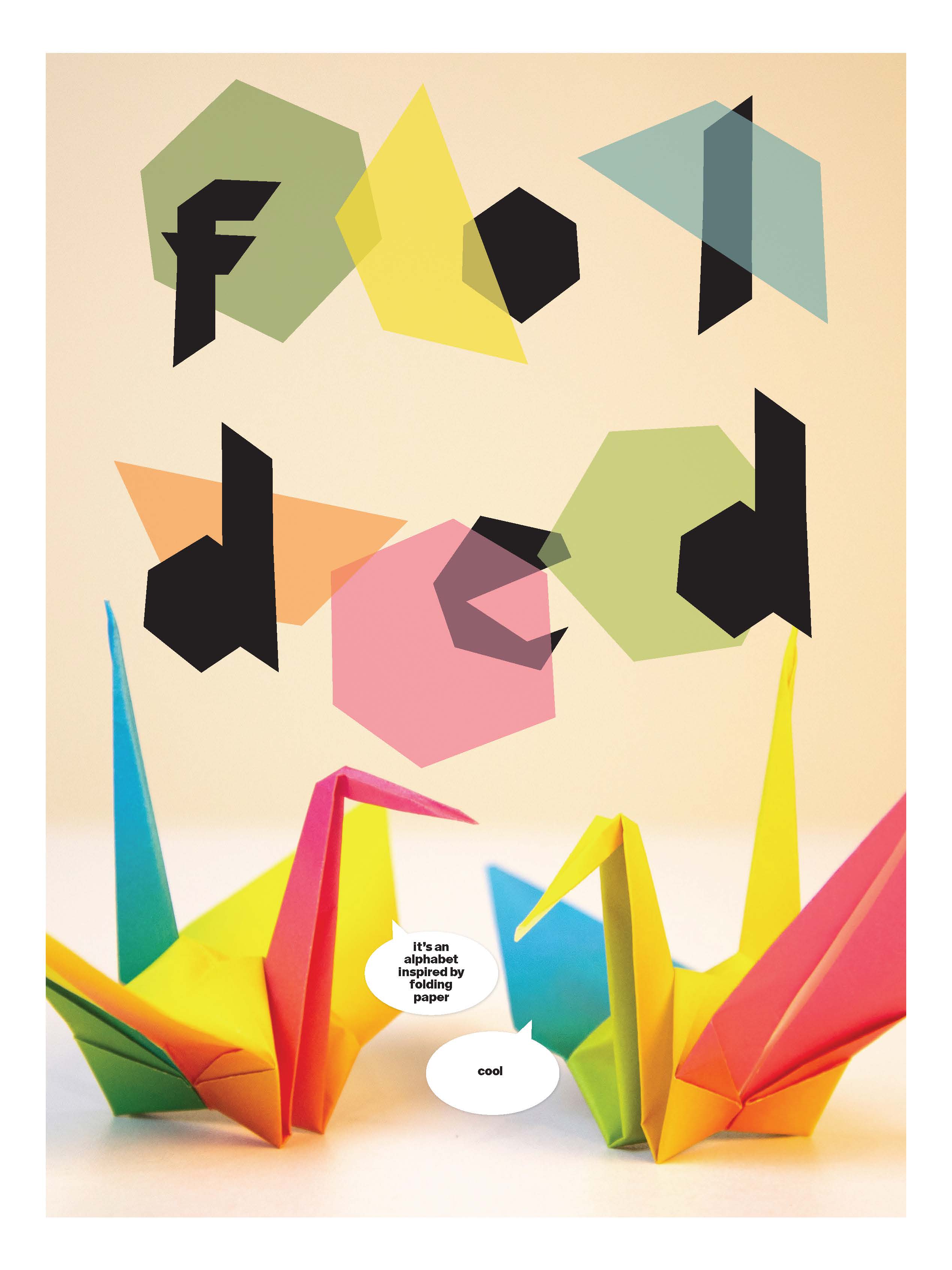
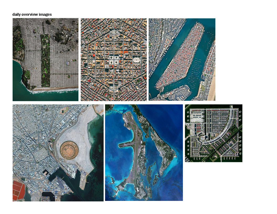
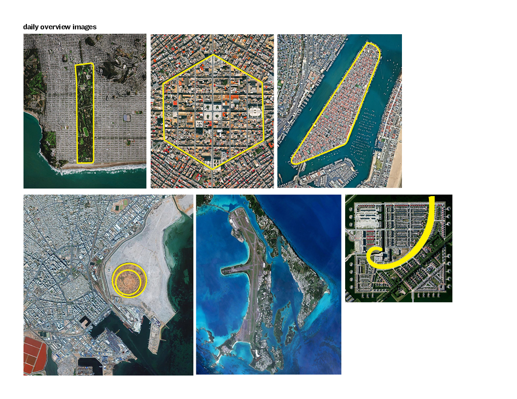
This typeface design project has evolved in an interesting way. Let me outline the process. We were prompted to find shapes to use as a base for creating a typeface. I focused on the images found on Overview. (Overview uses satellite and aerial imagery to demonstrate how human activity and natural forces shape our Earth.)
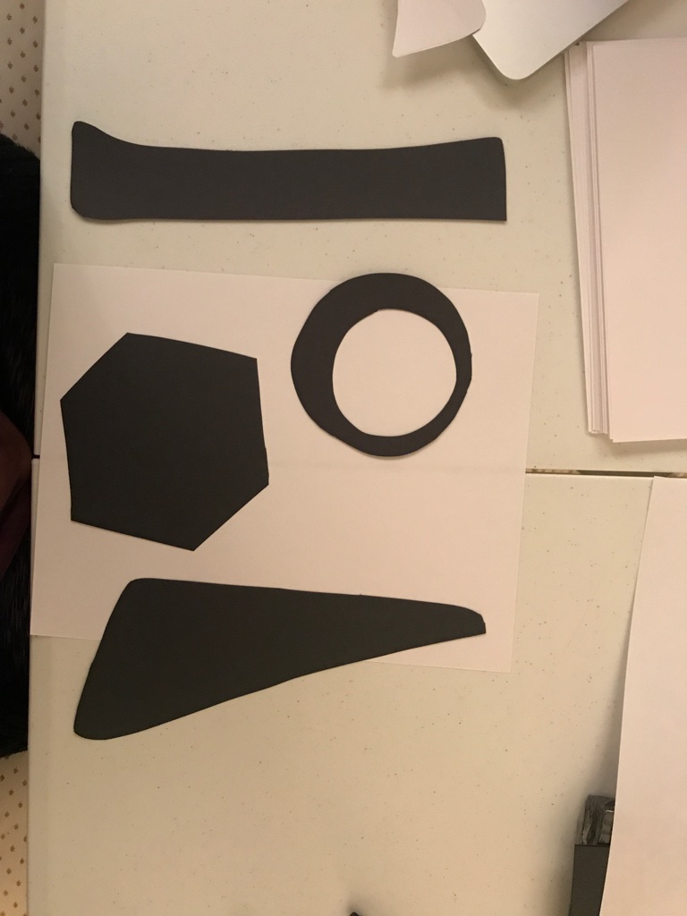
Next, I cut the shapes out of paper many times — these are now my building blocks to form my alphabet. I liked how tactile this process was; it gave easier insight into how the shapes would connect in order to form the familiar typographic figures. I didn’t have the bias of the computer to tell me how to do it; there was more room for experimentation.
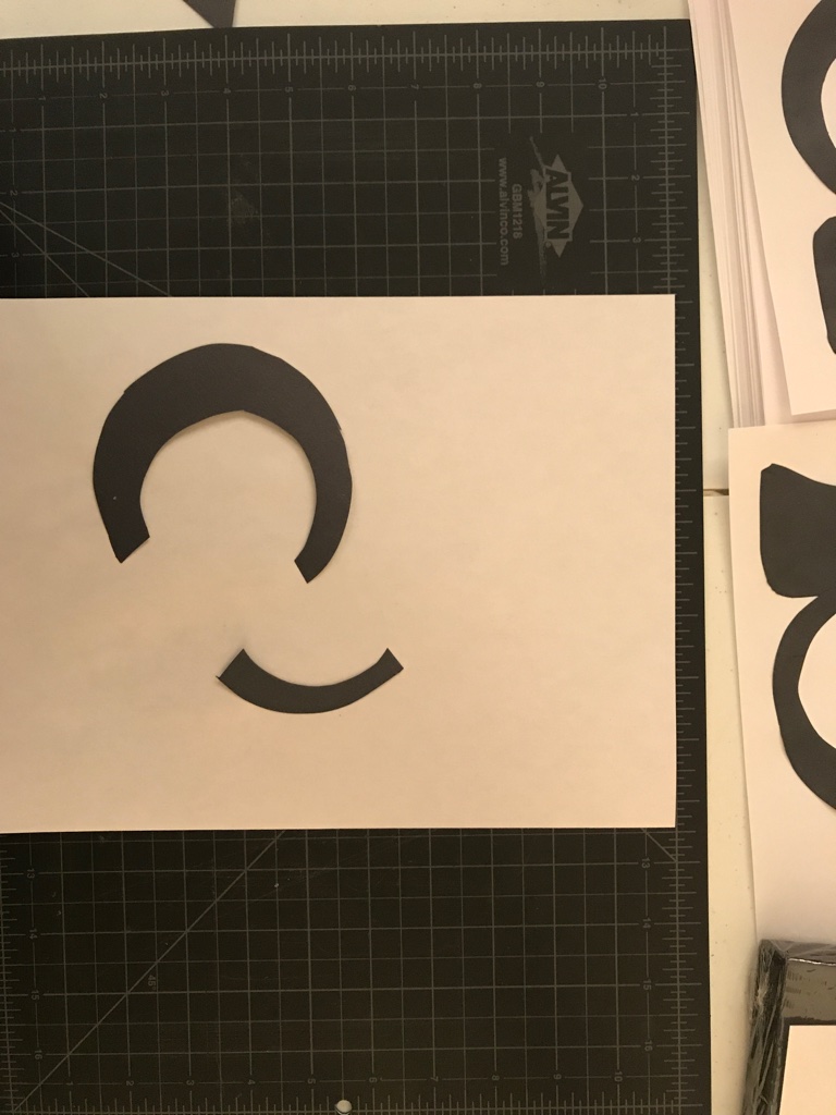
I assembled each character (after a lot of trial and error) and glued it to a white sheet of paper.
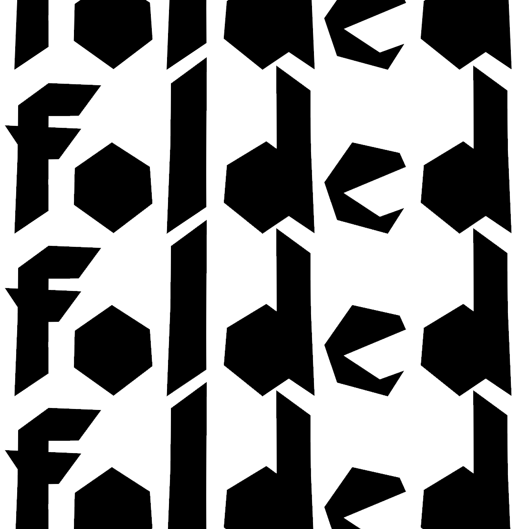
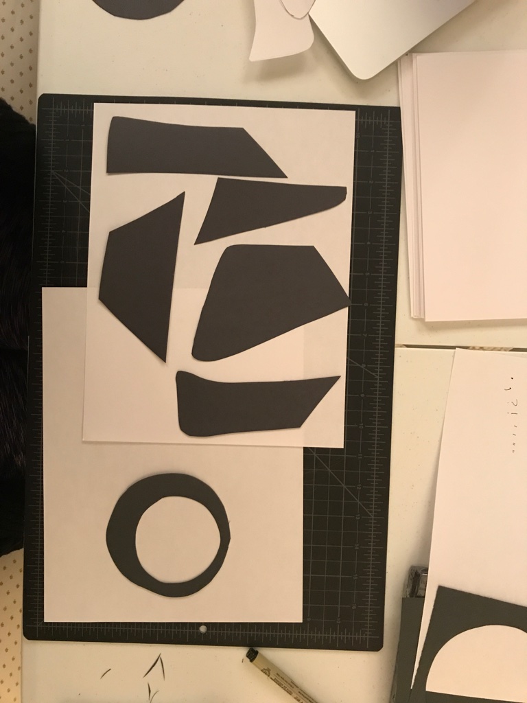
This was a fun set; but I was especially into the way the letters “u v w x y z” looked. Turns out I only used the half hexagon shape for those letters:
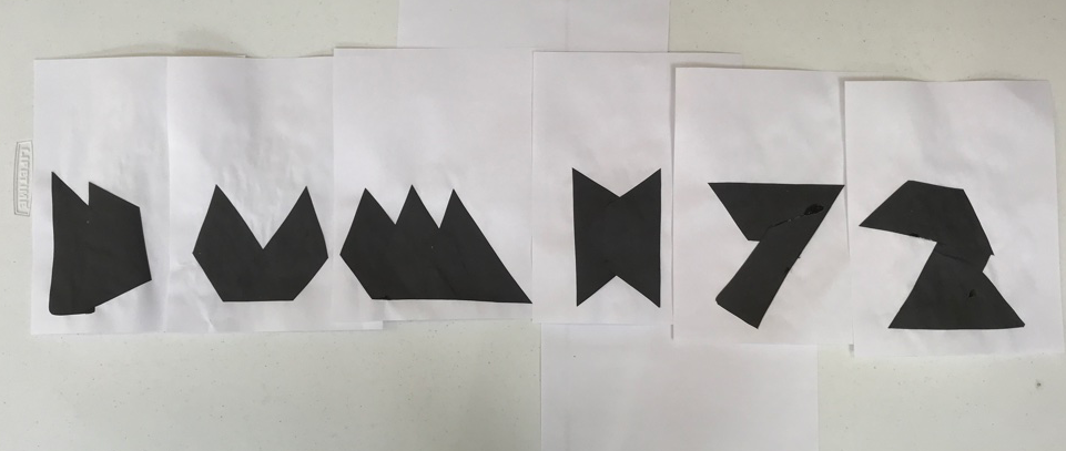
I decided to explore creating the whole alphabet using only that hexagon shape. It gave an illusion that one could achieve the forms by folding paper cut on an angle. For a few characters, I needed to use a cutout shape of the top of the hexagon to form a counter or bowl (”c” & “e”), but the rest are just the same hexagon shape overlayed or placed next to each other.
