Collection
It’s the first color listed in the set of primary colors. It can affect the speed at which we do things. It means stop. It is lucky. It means joy. It means anger. It has rich historical and contemporary meanings, yet it is a color we see almost each and every day. Even though red has a variety of meaning, we all see it differently and experience it in our own way.
This project is meant to explore how pervasive red is in our enviroment, and how the way we design and display a collection
can elevate/make beautiful or show the ordinariness of red.
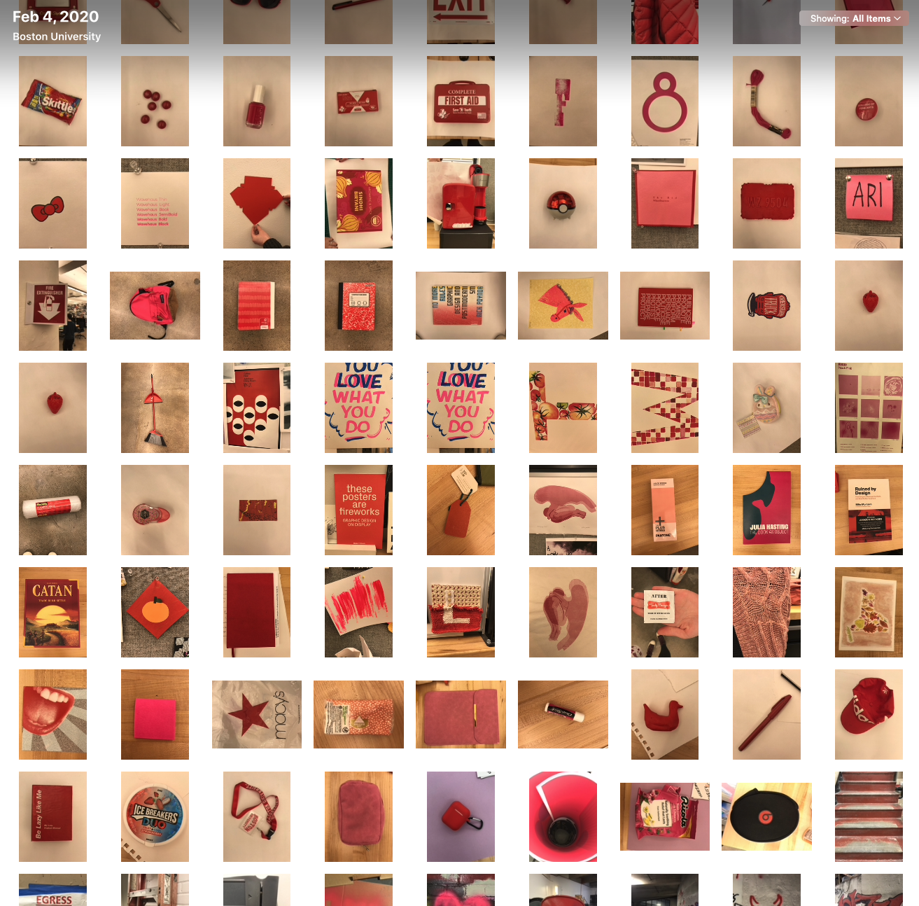
I got to work with Kateri on this project. We started taking photos of anything red we could find in our spaces, at home and in the studio.
Next, we tried some different ways to display this collection. First up,
some art posters.
This one showed a gradient of red items, from darkest to lightest. In some cases we focused in so much on the subject, you can no longer tell what it is.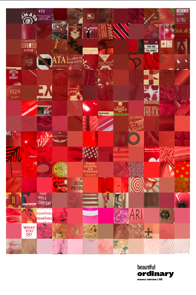 This poster highlighted some of the textures we found in the 234 images we collected.
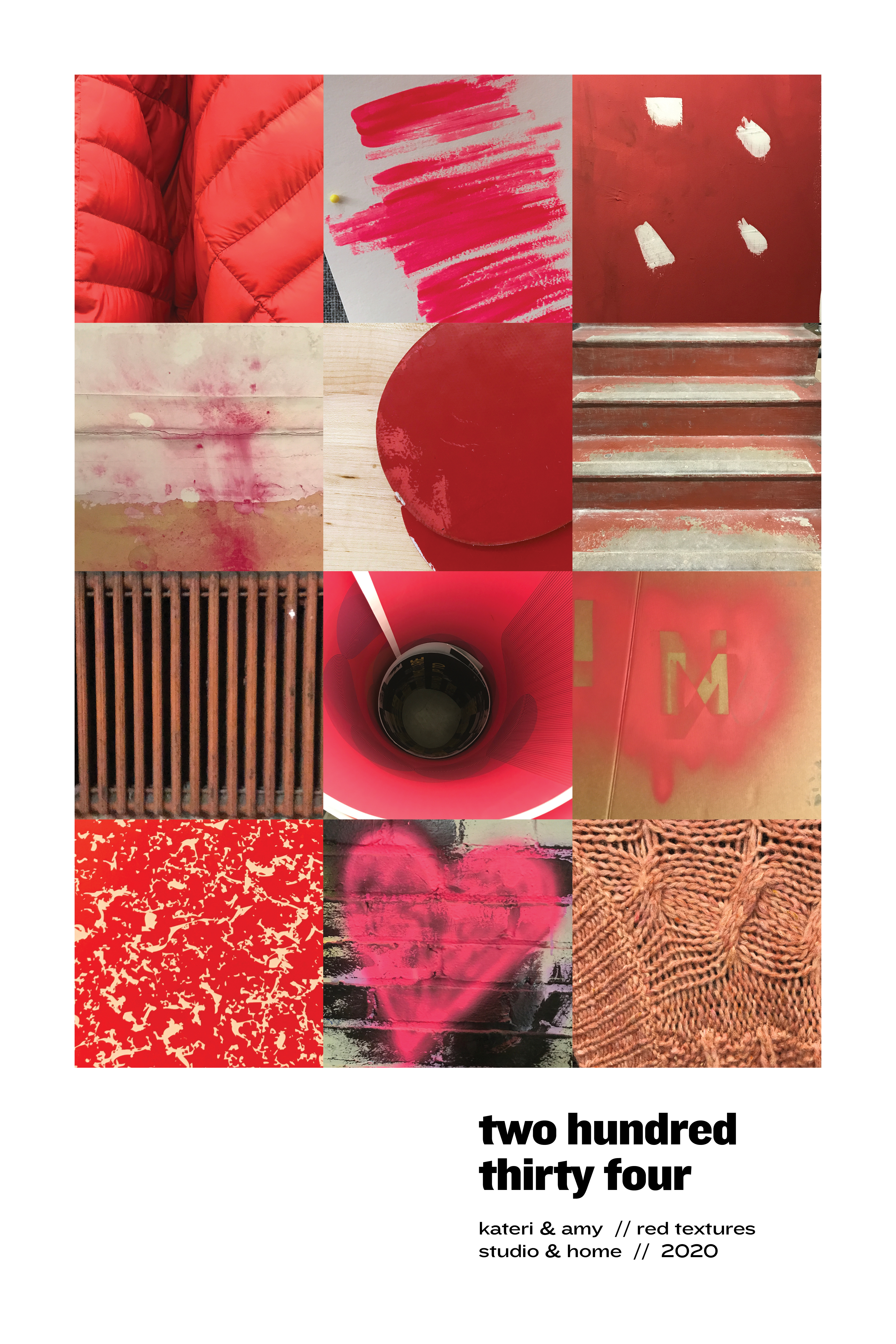
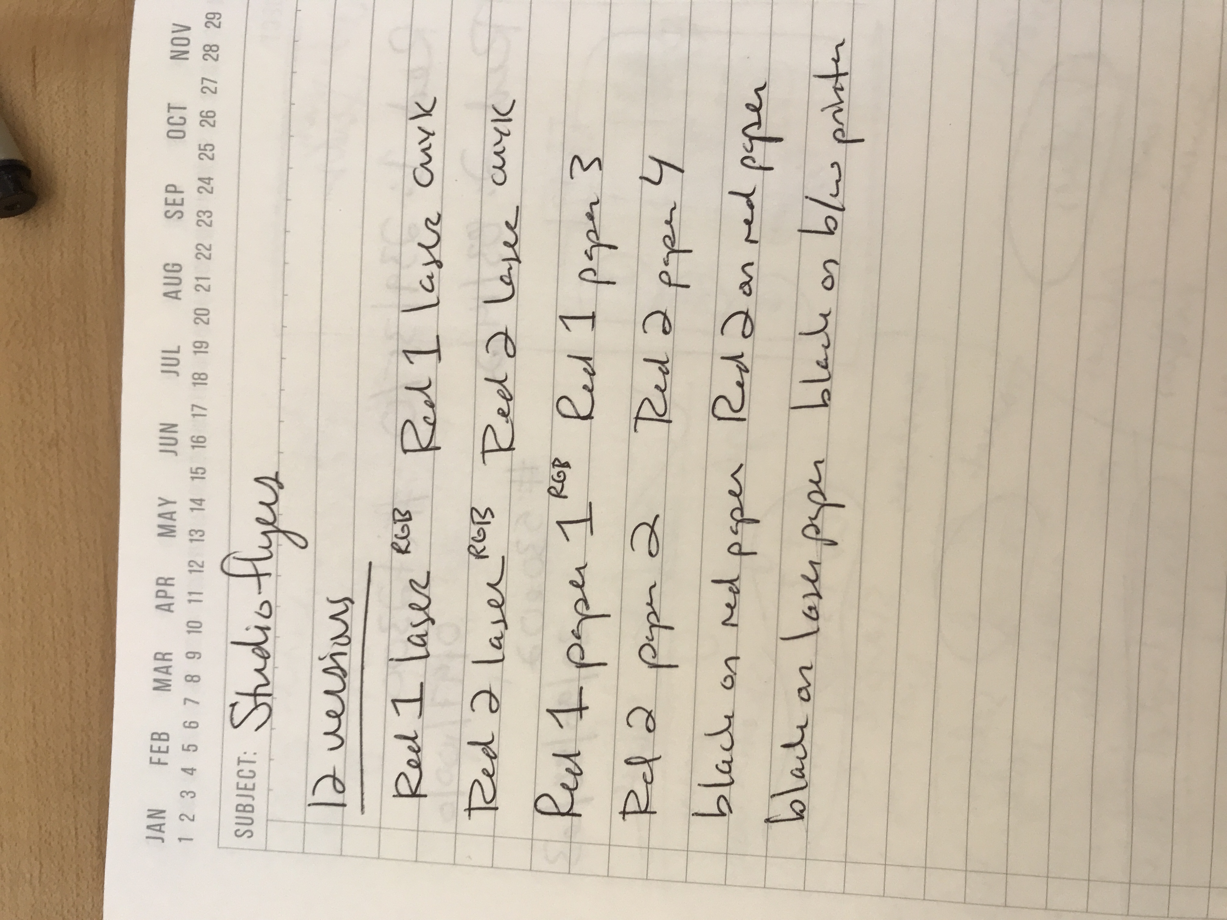
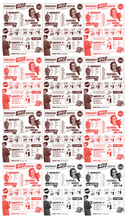
We noticed that a lot of the red items we found are everyday objects we take for granted. We created this generic-looking flyer to advertise the objects.
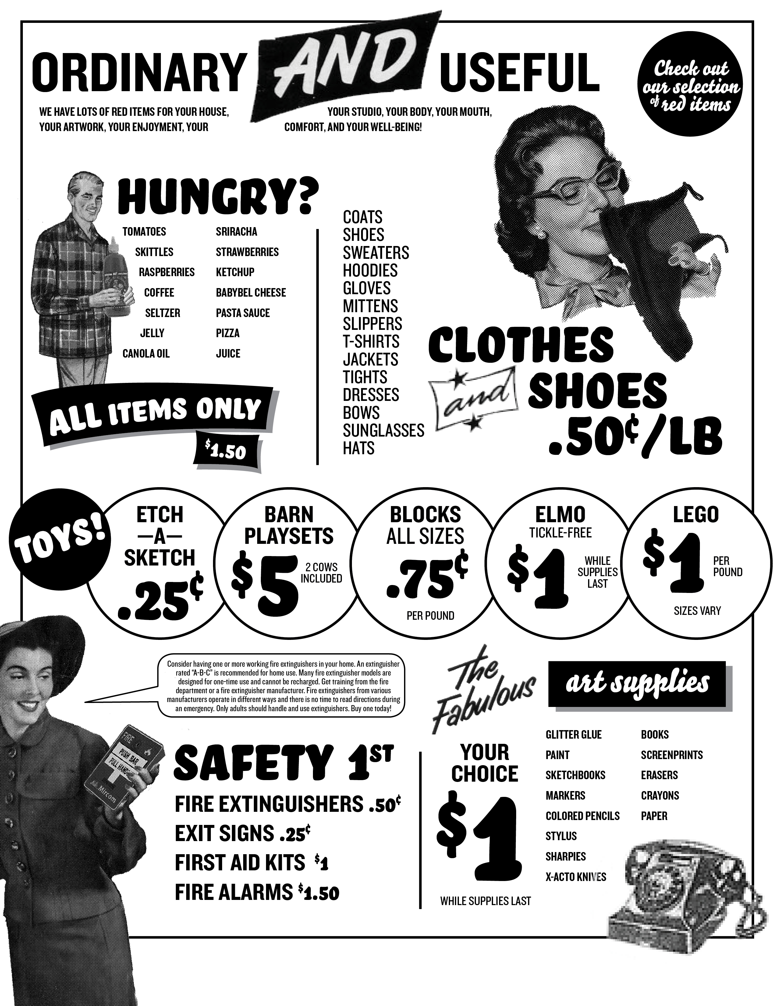
We also used this flyer as a sort of drawdown; printing it with different color profiles, on different papers, as we were having trouble getting our art posters to print the way we wanted them to. (For the record, it looked best on newsprint, with a brighter red, in CMYK or RGB.)
Kateri also created a video exploring the different emotions red can express.